Design Principles (Project 3)
Design Principles (Project 3)
- October 23, 2020
30.10.2020 - 27.11.2020 ( Week 11- Week 14 )
Yu Dawei/ 0344780 / BDCM
Design Principles
Project 3 Visual Analysis
LECTURER
This week the topic of our lecturer class is visual analysis. Ms Maria said that let us watch the previous lecture video to understand what we have to do for this final project. For this final project. First, we have to find a poster design from the web, and use 3 phases which are: Observation, Analysis and Interpretation to explain this poster. the words should be around 500. Second, we have to produce a work of design in A4 or A3 size, inspired/influenced by the design we have analyzed, and write 150-200 words rationale about it.
Instructions
Part 1: Visual Analysis
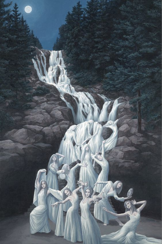 Fig 1 Water Dancing
ObservationAt first sight, the artwork layout is in A4 format and the overall colours used are white, grey, blue, black and navy blue. Overall, this artwork use cool tone as the mean tone. The waterfall become dancing girls at the bottom of the artwork. There is a moon at the top left of the artwork. At the bottom, these dancing girls are the main features in this artwork.
Analysis
This artwork is unsymmetrically balanced, the trees at the left and the right gave us a repetition. The emphasis is on the bottom image -the dancing girls in white dresses. These dancing girls come from the waterfall from the top of mountain in the artwork which produce the movement. The darkish background with the girls in white dresses make a strong contrast.
InterpretationRob Gonsalves1959 - 2017
Born in Toronto, Rob Gonsalves graduated from the Architecture program at Ryerson University and worked in the field for a few years before embarking on internationally acclaimed painting career.
His architectural studies gave him the skill sets to manipulate points of view, perspective and scale in 2-D and enabled him to bend and play with reality. His influences include Magritte, Remedios Varo, Kurerlek and the ProgRock album covers of his teens.
Rob Gonsalves drew from his own personal narrative. He was inspired by Toronto and New York architecture, the night sky and the rugged, Eastern Ontario landscape of rock, trees and lakes where he eventually settled in 2001.

Fig 1 Water Dancing
Observation
At first sight, the artwork layout is in A4 format and the overall colours used are white, grey, blue, black and navy blue. Overall, this artwork use cool tone as the mean tone. The waterfall become dancing girls at the bottom of the artwork. There is a moon at the top left of the artwork. At the bottom, these dancing girls are the main features in this artwork.
Analysis
This artwork is unsymmetrically balanced, the trees at the left and the right gave us a repetition. The emphasis is on the bottom image -the dancing girls in white dresses. These dancing girls come from the waterfall from the top of mountain in the artwork which produce the movement. The darkish background with the girls in white dresses make a strong contrast.
Interpretation
Rob Gonsalves
1959 - 2017
Born in Toronto, Rob Gonsalves graduated from the Architecture program at Ryerson University and worked in the field for a few years before embarking on internationally acclaimed painting career.
His architectural studies gave him the skill sets to manipulate points of view, perspective and scale in 2-D and enabled him to bend and play with reality. His influences include Magritte, Remedios Varo, Kurerlek and the ProgRock album covers of his teens.
Rob Gonsalves drew from his own personal narrative. He was inspired by Toronto and New York architecture, the night sky and the rugged, Eastern Ontario landscape of rock, trees and lakes where he eventually settled in 2001.
Magic Realism is a style of painting where reality is mixed with magic. Rob Gonsalves's work is categorized as Magic Realism. More specifically, his paintings have an autobiographical, symbolic narrative that invites the viewer into his beautiful mind where alternative realities exist at the same time. His work is a visual, human experience of quantum theory’s Entangled Spaces and Time. Rob Gonsalves explored oil on board initially. His mature work is acrylic paint on stretched canvas.
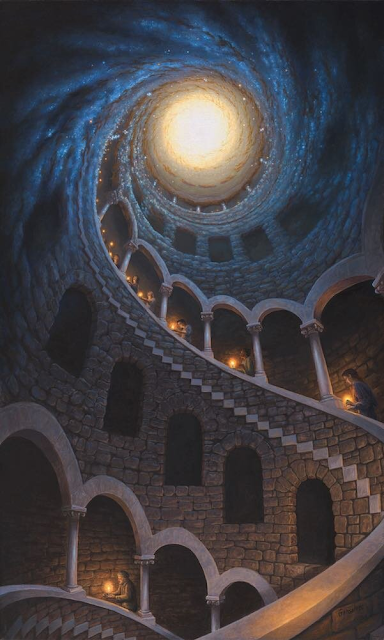
Fig 1.2 Stardust
Part Two: Design
IDEA EXPLORATION
The thought behind my artwork is to spoke joyful imaginations to people like me who still can find inner child willing to swing so high and shoes can touch the sky in their dreams.
IDEA #1
The initial idea was to showcase the whales not swim in the ocean but to fly in the sky. This produce the idea of dreams. Because this phenomenon only success in dreams. The person who sits at the tail end of the road is watching the flying whales let us know that the person still has the mind of inner child.
Fig 2 Flying WhalesIDEA #2Before showing the final artwork, here are the pictures that I have referenced and used for the artwork, along with a brief process of producing the artwork.
fig 2.1 Flying ship
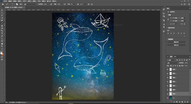
Process

Final Artwork
Fig 3 Final_ JPG
Fig 3.1 Final_PDF
RATIONALE
First things first, the thought behind this artwork lies on joyful imaginations in the dream. The initial idea was to showcase the whale not swim in the ocean but to fly in the night sky. This produce the idea of dreams. Because this phenomenon only success in dreams. The flying whale and flying food around the girl show the principle of design which is movement. The harmony is also evident, the night sky with the similar color tone whale. Also, there is a contrast shows between the girl's red clothe and the blue whale.
Final ReflectionWhat have I learnt in this module?Before taking this module, I never knew there were so many principles when it comes to design. I was very surprise when I first come into this class.
What did I enjoy the most? I've really enjoyed the week when we had to make artwork based on the harmony and unity principle. The reason being I had relatively more freedom to create what I want compared to the other weeks. I really had fun illustrating the artwork for that week. As for my favourite part of this module, it's this final project.
What did I not enjoy the most?I don't really have anything to complain about to be honest. The only thing I'm not very enjoy is the 1v1 consultation every week, because it always got delayed.
What have I learnt about myself through this module?I've realized that I still have to push myself further to do better job when I use the adobe Photoshop and the Illustrator. I think I was doing well at this first semester but I still have huge amount things need to be improved.
What has changed and what has not in my learning journey?Obviously, I have a newfound appreciation for designs. My perception of design has changed, and I admire designers even more now. The thought and processes they have to go through to produce good art is admirable.
What could be improved in this module?
As mush as I want to give suggestions for this module, I can't. This module has been really helpful, and the way the lecturers handled classes is very efficient. Every piece of information that I needed could be found in Microsoft Teams and Google Classroom.
IDEA EXPLORATION
The thought behind my artwork is to spoke joyful imaginations to people like me who still can find inner child willing to swing so high and shoes can touch the sky in their dreams.
Fig 2 Flying Whales
IDEA #2
Before showing the final artwork, here are the pictures that I have referenced and used for the artwork, along with a brief process of producing the artwork.
fig 2.1 Flying ship
Process


Final Artwork
Fig 3 Final_ JPG
First things first, the thought behind this artwork lies on joyful imaginations in the dream. The initial idea was to showcase the whale not swim in the ocean but to fly in the night sky. This produce the idea of dreams. Because this phenomenon only success in dreams. The flying whale and flying food around the girl show the principle of design which is movement. The harmony is also evident, the night sky with the similar color tone whale. Also, there is a contrast shows between the girl's red clothe and the blue whale.
Final Reflection
What have I learnt in this module?
Before taking this module, I never knew there were so many principles when it comes to design. I was very surprise when I first come into this class.
What did I enjoy the most?
I've really enjoyed the week when we had to make artwork based on the harmony and unity principle. The reason being I had relatively more freedom to create what I want compared to the other weeks. I really had fun illustrating the artwork for that week. As for my favourite part of this module, it's this final project.
What did I not enjoy the most?
I don't really have anything to complain about to be honest. The only thing I'm not very enjoy is the 1v1 consultation every week, because it always got delayed.
What have I learnt about myself through this module?
I've realized that I still have to push myself further to do better job when I use the adobe Photoshop and the Illustrator. I think I was doing well at this first semester but I still have huge amount things need to be improved.
What has changed and what has not in my learning journey?
Obviously, I have a newfound appreciation for designs. My perception of design has changed, and I admire designers even more now. The thought and processes they have to go through to produce good art is admirable.
What could be improved in this module?
As mush as I want to give suggestions for this module, I can't. This module has been really helpful, and the way the lecturers handled classes is very efficient. Every piece of information that I needed could be found in Microsoft Teams and Google Classroom.
As mush as I want to give suggestions for this module, I can't. This module has been really helpful, and the way the lecturers handled classes is very efficient. Every piece of information that I needed could be found in Microsoft Teams and Google Classroom.


评论
发表评论