28.8.2020 - ?.?.2020 (Week ?)
Yu Dawei/ 0344780 / BDCM
Design Principles
Task 1 Exercises/Projects
LECTURES
Week 1/ Elements & Principles of Design, Contrast, Gestalt Theory
Ms Maria briefed us about the subject in general and how we should post every week on our e-blog for each exercises.
Next, we were taught about the principles of design. They are the rules that we have to abide to in order to make a good design with the right arrangement of elements. They consist of:
- Balance ( symmetrical, asymmetrical, radial ) = it's about equal proportion that will soothe the eyes
- Emphasis ( contrast or focus ) = it's achieved when there is a difference, either in shapes, colors, etc.
- Repetition = it can be used to create movement, pattern and rhythm
- Movement = caused by a consistency
- Harmony = comes with similarity ( when there is balance, there is also harmony)
- Unity = something will look as one
The lecturer also asked us to note that harmony and unity come together.
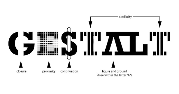
Contrast here doesn't always need to be a sharp difference, sometimes it can be flatter, as long as it's appropriate and able to create a visual excitement and interest audience. The last thing covered was the Gestalt Theory. This is actually my first time hearing it and I learned that it's actually about how people perceive the world around them. We studied about:
- Figure-ground = it's about how our mind will see the full ground or background first
- Similarity = it's to tell us some things in the design belong to the same category
- Proximity = if some elements are grouped together, they must have a certain function
- Continuity = it's more like about how we can follow the flow of reading with it
- Closure = usually it's applied to shapes; it works because our mind will try to connect unseen lines

Week 2/ Emphasis, Balance, The Golden Ratio & Rule of Thirds
Emphasis determines the dominance and focus, the loudness of a certain element(s) that attracts the attention. It can be used in colour, shapes, value, lines, form and space.
Balance is the visual equilibrium of the arrangement of the elements.
The Golden Ratio is perceived as a perfect beauty because it creates visual balance, harmony and also increases the appeal of the composition.
Rule of Thirds is applied by aligning a subject with the guide lines and their intersection points, placing the horizon on the top or bottom line, or allowing linear features in the image to flow from section to section.
Week 3 - Topic 3: Repetition, Movement
Exercise 1 Contrast and Gastalt
In this exercise, we were asked to apply contrast and gestalt using black and white paper (any type of paper) submission in PDF. Because i don't have black paper, so i use red colour paper and white paper to do the work.
CONTRAST
Contrast is usually applicable to the values, colors, textures, shapes, edges and detail of an artwork. In this image below, i used black and white to make strong contrast to show people the shape of the gourd.

Closure
The principle of closure states that when we look at a complex arrangement of visual elements, we tend to look for a single, when you see an image that has missing parts, your brain will fill in the blanks and make a complete image so you can still recognize the pattern. I used black and white paper to cut and combine the lines, the white parts are the missing part, but people can imagine and guess out that this is an egg.

Exercise 2:Emphasis, Balance
This week, we learned about emphasis and balance from the lecture and now it's time for us to apply them in this exercise. The materials are color pencils / pens and markers.
Balance
Emphasis
Exercise3: Repetition, Movement
Rough sketches
Repetition
Movement
Exercise 4 Harmony and Unity
Harmony uses the elements of art (colour, line, shape, form, value, space, texture) as a vehicle to create a sense of togetherness amongst otherwise separate parts. The colour of the sunset and its reflection, the tree and the grass create the sense of togetherness and not looks odd.
Harmony
Unity
The background colour and the leaves, the vase and the colour of the table are the same kind of colour scheme, so it look like unity and not abrupt.
Exercise 5 Symbol and Combination design
Symbol
I create this symbol, melting Earth with the dead tree at the top, meaning the problem of the climate warming made would affect our lives, consequences that give us will make us like this tree.
INSTRUCTION
Feedback
Week1
Ms Maria let us use black and white paper to make contrast and closure project. But I use red paper, so I change the to black and white.
Week2
Ms Maria said that my balance and emphasis project looks clear, and she knew what I want to express, but I need to draw more details.
Week3
Ms Maria said that my movement project was misunderstood, so I change it.
Week4
Reflections
Week1
Experience
When I first met Ms Maria online, I thought that she was so cool. Since the first meeting, the lecturer had been encouraging us to ask her if we have questions. During this exercise, I'm so glad that she assisted me to get my final design.
Observation
When I was working on this exercise, I observed that I can panic over simple things. I wasn't able to come up with any idea at first because I was trying to make something great without thinking of the sole purpose of this exercise. On the first day I started working on this exercise, I spent a few hours to come up with a good idea and regretted it right away because I realized that I was not doing things right.
Findings
I found myself not giving up with my idea even though I had to resubmit the drafts for three times. It was my first. But, I wasn't hating it because I figured that it was a way for me to improve my problem-solving skill. I also learned that I should always stick to what matters, by taking seriously the most essential thing in a task and think simply.
Week2
Experience
It was nice that we got to learn from the basic of design. I was still having a hard time to come up with ideas since it's back to basic and there's a lot of concepts to choose from.
Observation
In this exercise, I observed that I'm not very confident in coloring. I realized that I've always got used to sketching without coloring it.
Findings
I know that I am not the best and still lack a lot. I found that I need to study more about color schemes and how to color.
Experience
Observation
Findings
Week4
Experience
Observation
Findings


评论
发表评论